← Back to work

Breathefree: From Cluttered App to Daily Habit

I led end-to-end UX design for Breathefree, Cipla's lung-care app: turning a cluttered, low-adherence tool into a guided, habit-forming daily companion for people managing asthma, COPD, and allergic rhinitis.

Breathefree: From Cluttered App to Daily Habit
Timeline
10 months
My Role
Sr. UX Designer
Team
Lead + 2 Junior Designers, Product, Engineering
Platform / Tools
Healthcare · Figma
Goal

Turn a declining, hard-to-navigate lung-care app into a guided, habit-forming daily companion, one built around small, trackable tasks Cipla's patients could actually stick with.

Challenge

Breathefree's daily active users were declining 2-3% every month. Engagement was down, uninstalls were up, and adherence to daily lung-care routines, the entire point of the app, was low. The homepage itself was part of the problem: users described it as cluttered and confusing, unsure of where to go or what the app was even for.

Core features were barely discovered. Most users only ever touched the breathing exercises, the simplest feature to find, while everything else went unused, especially among users in Tier 2 and Tier 3 cities. The app lacked guidance and a sense of credibility, in a category where trust in the tool is inseparable from trust in the guidance it gives.
Discovery

I ran a cohort analysis alongside direct app feedback from active users, transcribing every response and running it through thematic analysis and affinity mapping to find patterns in how people were actually managing their condition day to day.

The clearest pattern: users in their 20s and 30s, newly diagnosed, were proactive about finding solutions, but doctor consultations were too short to give them the day-to-day guidance they needed. Nearly everyone had already built their own workaround routine, alarms, medicine reminders, YouTube breathing videos, home remedies, stitched together outside the app entirely.

10
Users interviewed, moderated 1:1 sessions across Tier 1 & 2 cities
5 / 5
Male / female split in the research cohort
2
Methods: moderated interviews, plus secondary industry research
14
App features rated by users to prioritize the roadmap
Feature prioritization

Rather than guess at a roadmap, I had users rate how useful they’d find each candidate feature for managing their lung health. The scores split cleanly into tiers, and gave the team an evidence-backed order to build in.

Potential hook features

avg. rating 9+
Breathing exercises
9.7
Learning how to use inhalers
9.5
Insights & tips on lung health (content)
9.2
Medicine reminders
9.0
User goals

Patients managing chronic lung conditions

  • Needed daily guidance beyond short doctor consultations, especially for home and workplace management
  • Needed tasks that felt tied to real-world impact, not just information to read
  • Needed the process to feel motivating and sustainable, not another chore to track
What we shipped
  • Handheld action plans with personalized daily tasks: peak flow tracking, medication logging, breathing exercises
  • A redesigned homepage built around task completion, not passive content
  • Streaks and rewards to reinforce daily habit formation
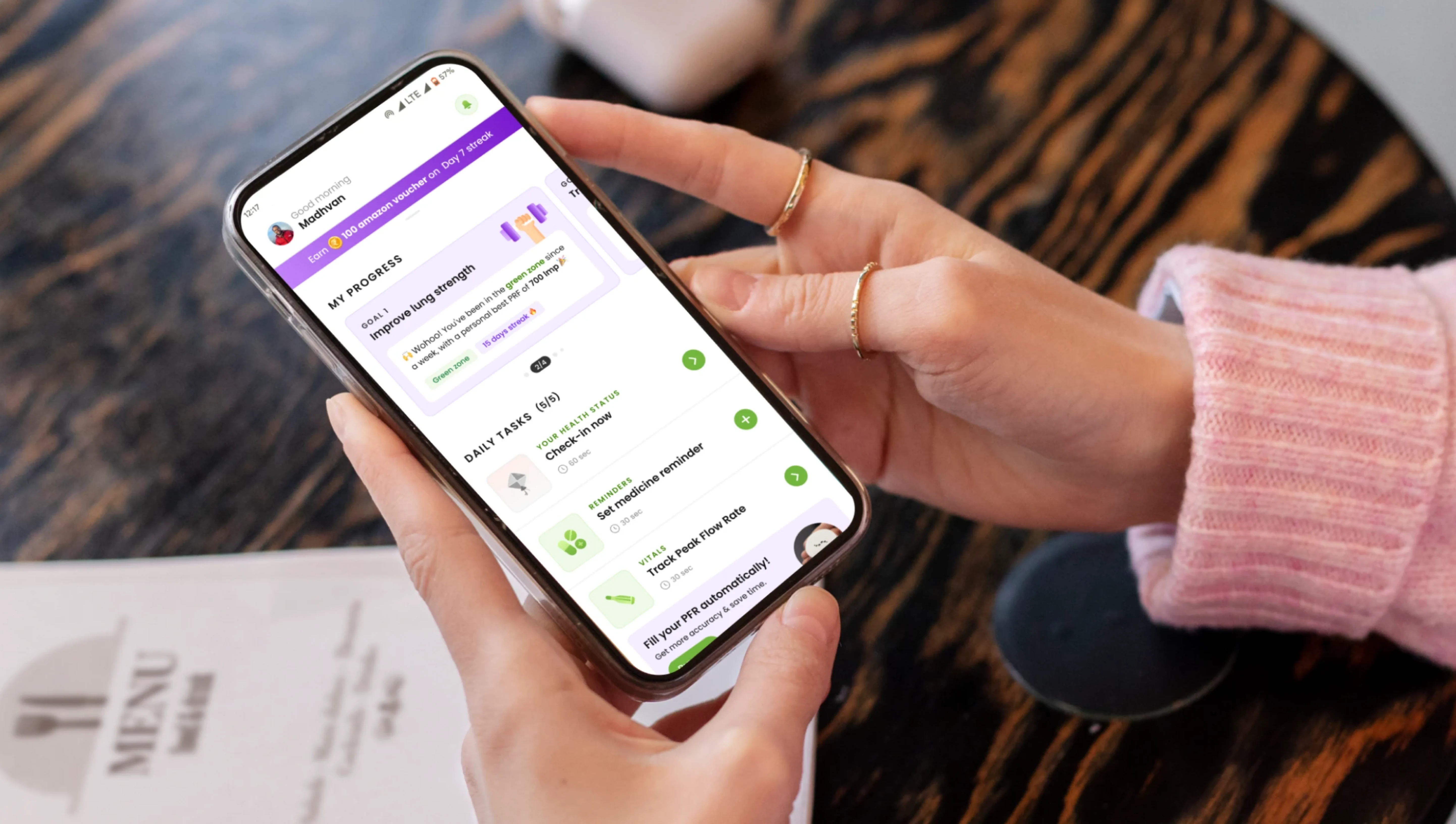
A patient checking their daily lung-health progress, goals, and tasks on the Breathefree app on their phone
My approach

My approach was to give users something to do, not just something to read. Research made it clear people needed tasks to see real-world impact, so I leaned on the trust patients already had in their Cipla doctors and turned that trust into a system of personalized, doctor-aligned daily tasks.

I converted research findings into a prioritized set of action items, then redesigned the homepage itself around task completion: vibrant, interactive logging journeys with motivational affirmations, and a streak-and-reward system layered on top to keep the habit going once it started.

01

Creating a hand held action plan for the users

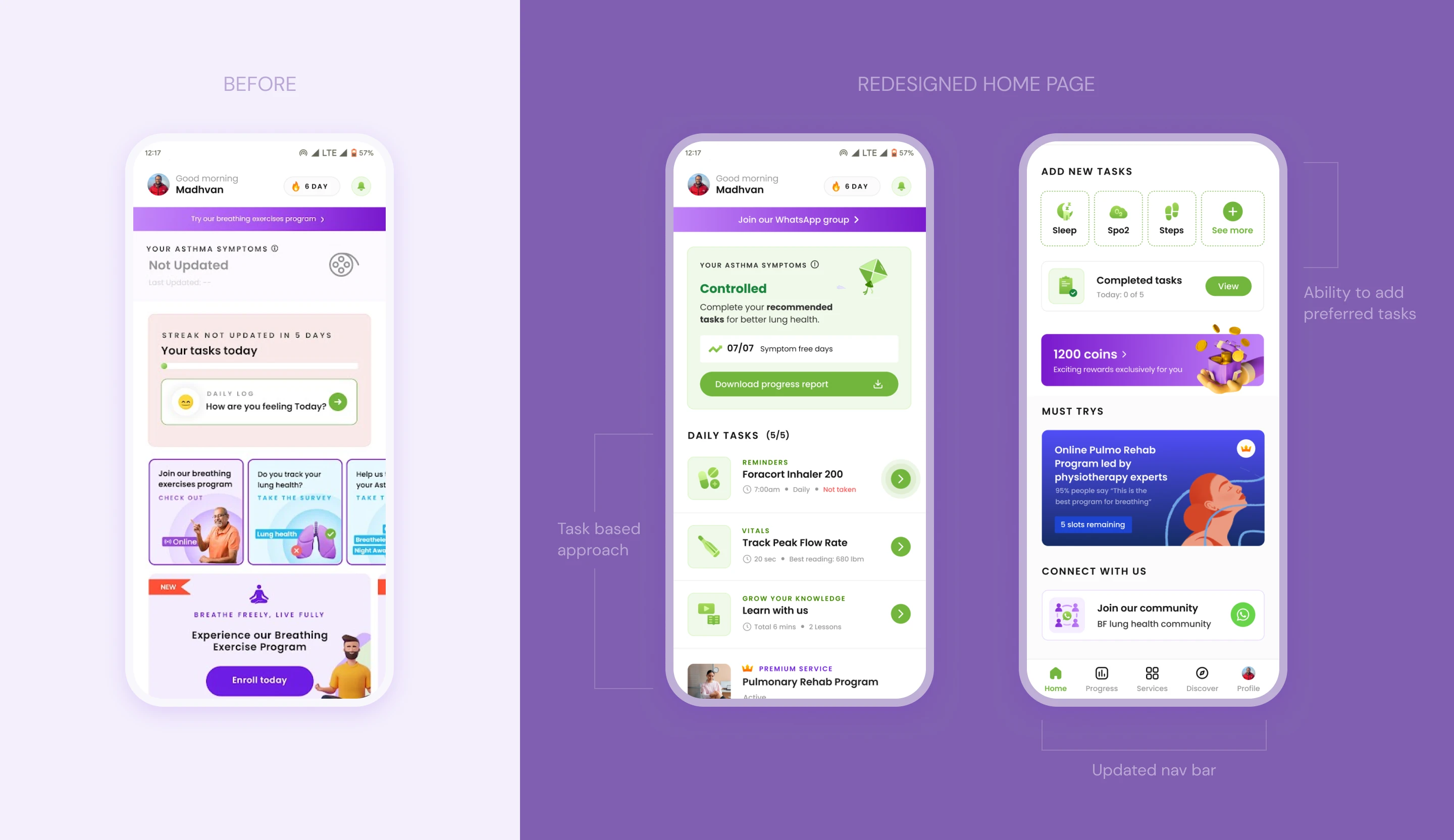
Users need tasks to do in order to see real-world impact. Since they trust Cipla doctors, they are already motivated to use the app. We need to push tasks like tracking peak flow rate, medicine doses, and breathing exercises to different cohorts in the most effective way.

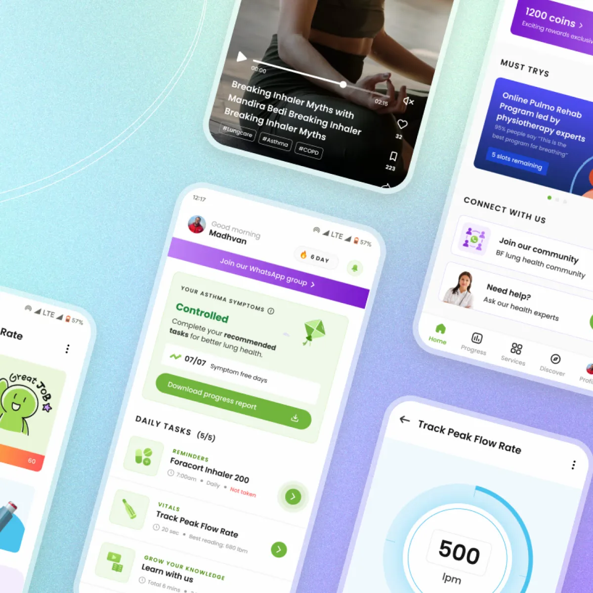
Before: cluttered homepage with unclear tasks. Redesigned homepage: streak tracker, asthma symptom status, and a daily tasks list with reminders, vitals, and lessons. Add New Tasks screen: quick-add tiles for Sleep, Spo2, and Steps, completed tasks summary, rewards, and must-try programs
02

Task logging & progress viewing made easy & user-friendly

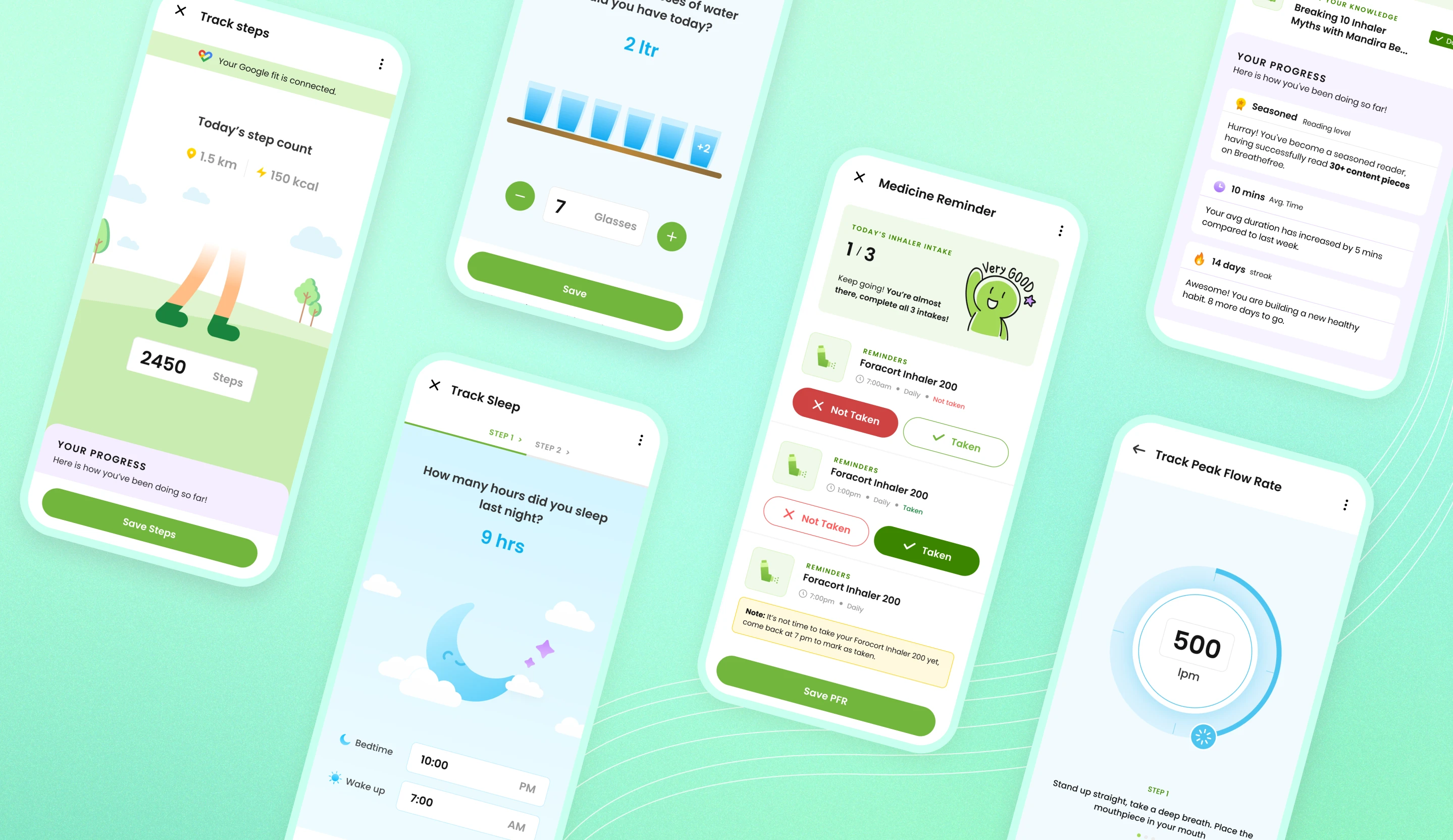
Since the home page was heading towards a task-oriented app, our focus was to create task logging journeys that are interesting and insightful. This was done by using bright colors, interactive data input, and positive affirmations.

Task logging screens: Track Steps, glasses of water logged, Medicine Reminder with inhaler intake status, Track Sleep hours, knowledge content progress, and Track Peak Flow Rate
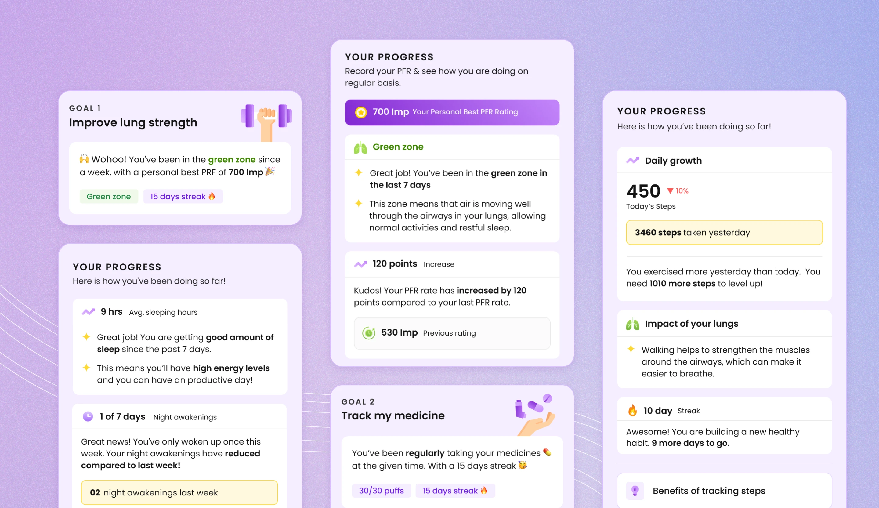
Goal cards for Improve Lung Strength and Track My Medicine, alongside progress cards showing PFR rating trends, daily step growth, and lung health impact insights
03

Kick starting gamification with streaks and rewards

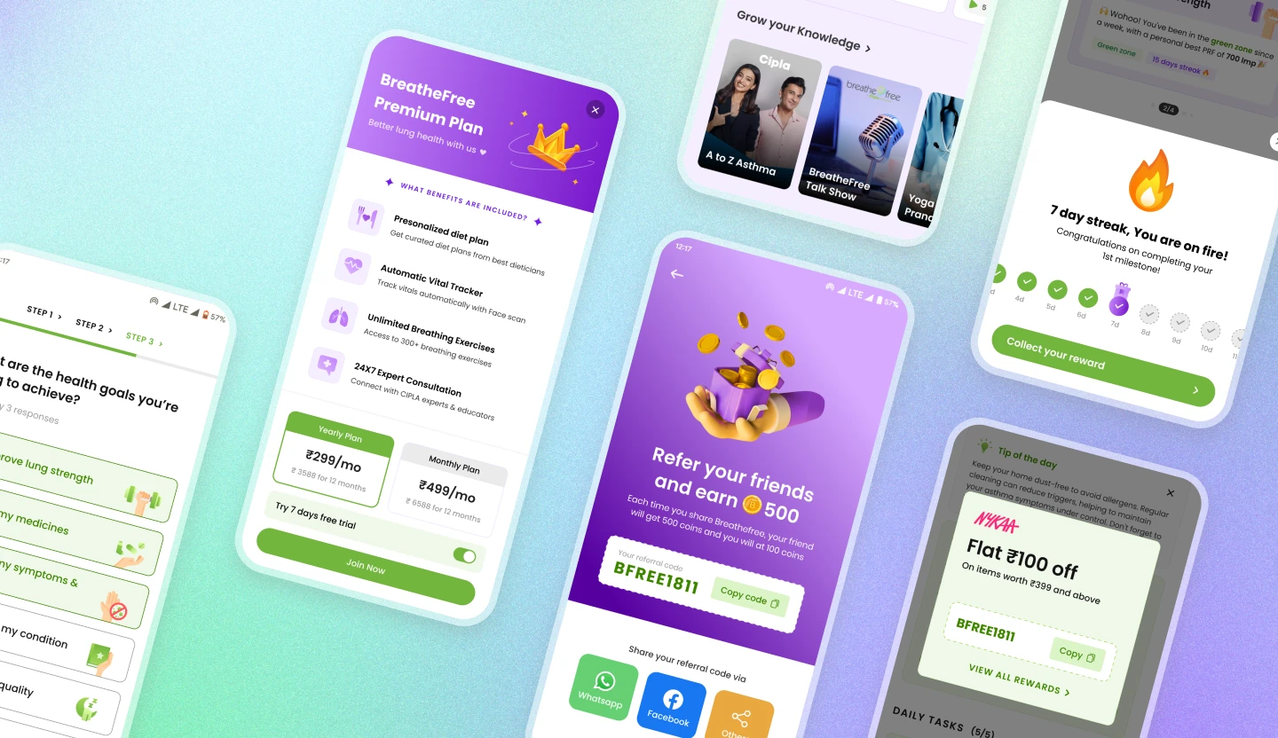
Gamifying the app was our way of engaging users better and helping them build good habits. Our interviews with people who have lung conditions showed us how important it is to make the process fun and rewarding.

Streak milestone celebration, BreatheFree Premium Plan upsell, referral rewards screen, knowledge content carousel, and a partner discount coupon, all part of the app's gamification and rewards system
Impact & outcomes
10 months
End-to-end ownership, from research to shipped UI
2
Junior designers mentored throughout the project
Portfolio highlights
  • Led end-to-end UX design for Breathefree, a Cipla lung-care app, from research through shipped interface, while mentoring two junior designers.
  • Diagnosed a declining-engagement problem (2-3% monthly DAU loss) through cohort analysis, direct app feedback, thematic analysis, and affinity mapping.
  • Uncovered that users had already built their own workaround routines outside the app, the clearest signal that guidance, not features, was the actual gap.
  • Redesigned the homepage around task completion instead of passive content, turning low-discoverability features into a guided daily flow.
  • Converted research insight into a system of doctor-aligned handheld action plans, leveraging existing trust in Cipla physicians to drive daily engagement.
  • Introduced streaks and rewards validated directly by user research, which had flagged 'making the process fun and rewarding' as essential for chronic-condition adherence.
  • Designed specifically for underserved Tier 2 and Tier 3 city users, who showed the lowest feature discoverability in research.
  • Took a caregiver-oriented design approach after research showed the app lacked guidance and a sense of credibility in a health-critical category.